-->
Showing posts with label color. Show all posts

Monday, September 10, 2012

Jewelry Box Makeover

I haven't blogged much during the past year, but I swear I've still been making.  For whatever reason, I just haven't had it in me to take all of those photos (you know how we take about 100 shots of the same thing just to get the one perfect photo for the post?).  Plus, there's writing the actual post which has never been my strong point.  There are those bloggers who consider themselves writers and then there are those bloggers who are like me.  We just want to get it out there and move on to the next project.

I let my Etsy shop lapse last year during my pregnancy.  I've just recently picked back up on it and have been bitten by that thrifting bug again.  I have to be REALLY careful with that.  I think a lot of us have to be careful with it.  Have you ever watched an episode of  "Hoarders" where they follow the person to a thrift shop and thought, "Oh man, that's so me!"  These people are acting like they're on a freaking treasure hunt, which is exactly how I feel when I walk into a thrift shop and grab a cart.  It's so easy to get carried away with the, "Oh, I can use this for something," or even worse, "So and so can use this for something."  Do you know how many hoarders I've seen who buy stuff for other people?  Stuff the other people probably don't even want.  

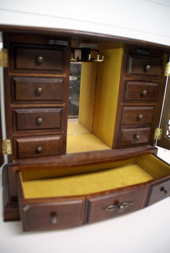
OK, I've gotten a little carried away.  I'm not really here to talk about my hoarding tendencies.  I'm here to show you a makeover.  A couple of weeks ago, I found two nice jewelry boxes.  Normally, I find these boxes with the tacky flowers etched into the door glass.  Ug...  I'm sorry, but no amount of paint is gonna take away from that.  I finished the first box a couple of weeks ago and have already listed it in my shop.  The other one is almost finished and should be listed tomorrow.  
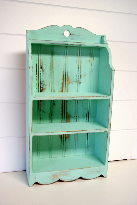

AFTER:


BEFORE:


Isn't that the coolest box?  I mean, even before, it was cool.  I knew right away what color I was going to use (Folk Art's Patina).  It looks perfect with the red interior!


Linking to:
Anti-Procrastination Tuesday
Get Your Craft On 
Made By Me
Wow Us Weds
Creative Spark
Look What I Made 
Sugar & Spice 

Wednesday, June 22, 2011

Color of the Week???


I'm not sure, yet.


Last month, I was inspired by this post from knack, to try a similar color.  I chose Martha's Rainforest.  It's a rich blue-green that I thought would appeal to those who aren't really into the whole cottage look.

I decided to try it out on this mug stand, and I have to say, I'm just not sure about it.  Maybe it's because it's not really my style.  I prefer the lighter colors that make up the shabby cottage look and this definitely isn't one of those.  It seems a little plain to me, and maybe it just needs to be distressed to add a little oomph to it.  What do you guys think? 


Even though I don't really think I like this color on the mug stand, I do think it might be perfect for this jewelry box that I scored at an auction awhile back. I think the design of the box, coupled with this vivid color, would make a nice India-inspired piece.  Yes???


*This post is part of a series of color posts.  To see all past colors, click here

Monday, June 13, 2011

Color of the Week - Meadow Mist

This week's color is another blue.  For whatever reason, I seem to be stuck on blues and greens.  I do have a couple of pink pieces that I've done and I'll probably be sharing that color next week, just to change things up a bit.

This color was used on two projects that I shared with you last week.  I'm reposting the photos below since these are the only two completed pieces I've used this color on.  I've got one piece that I'm still working on and I'll share that with you later this week.
cloche post is here

the shelf post is here


This is another great beachy color, but it's also a good shabby chic color too.  I'd say that if Sea Anemone and Sea Glass had a baby, this would be the result.  It's a Valspar color called Meadow Mist.  

I have to tell ya, the sample colors they show online usually DO NOT match the true color at all.  You can tell the difference between what's being shown on the link from Lowe's (above) and my photos.  This particular color has more green in it than what they're showing.  That just shows you how different a color can appear online.  I try to get my photos as close to the actual color as possible, but even that is a problem sometimes.  If you're in doubt, trust the paint chip from the store.  I'm not talking about the online chip, I mean the one you grab at the store.  That will be more reliable to you, in person, than what they show online or what I share with you.

I've been having fun with these color posts and I'm excited to try some different colors.  I'd like to step out of my comfort zone and go with something completely different than what I've been using.  So far the colors I've shared, have all been ones I had on hand.  I'm just starting to use a few that I bought specifically for these posts and again, they're green and blue.  Agggghh!!  I will say that one them, even though it's a blue, really has me outside of my zone.  So I guess I'm taking baby steps in the color world and I'm thrilled to have you all along with me!


*This post is part of a series of color posts.  To see all past colors, click here


Linking to:


Monday, June 6, 2011

Color of the Week - Sea Anemone

Welcome to this week's Color of the Week post.  This is a new color for me and so I've only got two pieces to share.

I bought this sample of Martha Stewart's Sea Anemone back in November when I was trying to choose paint color for my bedroom makeover.  It looked terrible as a swatch on my wall, and I just didn't care to try it on anything I wanted to sell.  Week after week, I kept reaching around it as I chose another color.  Poor Sea Anemone.  I finally decided to give it a try when I felt it was time to start listing more Beach Cottage items.  I'm glad I did!  It looks so much better than it did on my wall!  Out of my beachy colors, this one is my favorite.  It's a very pale blue.  Almost like a white with just a hint of blue. 

Here are the two pieces I've done with it so far.


Here's a neat little tidbit about the pedestal bowl.

The BEFORE bowl, was thrifted and given to me by my sweet friend and fellow SC blogger, Leslie, and it was purchased by another SC blogger, Carrie, with a Speckled Dog @ Etsy giftcard she won last fall.  Cool, huh?


Linking to:

Wednesday, June 1, 2011

Color of the Week - Patina

So, I've started this thing where I feature paint colors that I like to use on my trash to treasure and other projects.  I'd noticed that I used the same paint colors over and over and I thought it'd be kinda cool to share them here since the stuff I list on Etsy, where those colors were used, tends to "fly off the shelves".  I mean, if my customers liked these colors, it stands to reason that my readers and bloggie friends would too.

Really, there were only around four colors that I was using a lot, and so I'd only planned to do this color thing for as many weeks, but the feedback on these color posts has been so great that I've decided to carry on and share a new color with you each week.  This will help all of us (you guys and me) discover new paint colors.  I tend to play it safe and use only the colors that sell, but I believe this will help me climb outta that box.  I will try to have at least two projects to show with each color post, which means I'll be cranking out at least two Etsy items a week.  

As for the paint I'll be using, I like some Folk Art colors and I've really been into Martha Stewart colors lately.  It seems those are the only two brands/colors that I've shared so far, but they won't be the only ones forever.  I don't want to limit myself because there are tons of other colors/brands out there.  I do think I'd like to work my way through Martha's paint palette (you can pick up a complete palette, with all 280 colors, at Home Depot), though I will definitely not be trying all of them. 

Anyway, the color I'm sharing this week is another Folk Art color that I've used a few times.  It's called Patina and it works beautifully with antiquing glaze.  Of the projects below, all, except for the last one were glazed.


I hope you're all having a great week!  I'll be back on Friday with a scouting post.  A few of us in SC, NC & GA are looking to find fellow bloggers from the area.  If that's you, keep your eyes peeled for that post.


Linking to:
Hookin' Up With HOH @ HOH
Strut Your Stuff @ Somewhat Simple
Fridays Unfolded @ Stuff & Nonsense   
Feature Yourself Friday @ Fingerprints on the Fridge 
Frugal Friday @ The Shabby Nest 
Check Me Out Sat @ A Vision to Remember 
Met Monday @ Between Naps on the Porch

Sunday, May 22, 2011

Sea Glass


If you've been following me the past few weeks, you know that I've been sharing some of my favorite makeover paint colors.  You can find my past color posts here.

This week, I'm sharing another Martha color.  This one is called Sea Glass and it's another of those colors that's perfect for all things beachy. 

It's one of the colors that comes in a premixed sample.  I'd say if you're going to use this to paint small stuff, like me, you should go ahead and get a sample mixed.  I say this because the premixed samples have the a brush attached to the inside of the lid and it's kind of a pain to use.

With that being said, I'd like to share with you, the pieces I've painted with this wonderful color.


Linking to:

Thursday, May 19, 2011

In Love

Over the last couple of weeks, I've been sharing some of my favorite paint colors.  If you've missed those posts, you can find them here, here & here.

Last week, I stopped by Home Depot and browsed through the Martha colors, taking three color samples home with me.  I've fallen in love with the first one I used.  It's called Duck's Egg and it is GORGEOUS!  

Take a look at this beautiful pedestal bowl, transformed with a few coats of this beautiful color.
after

before

I predict there'll be lots of Duck's Egg pieces in my future.  Maybe even a furniture piece or two.


Sunday, May 15, 2011

Fresh Foliage

For the past two weeks (here & here), I've featured colors that I've often used on my Etsy shop items.  I've had a lot of fun going through all of my Picasa photos.  As I'm scrolling through my library, looking for that certain flash of color, a candid photo of family life will  jump out at me and I just have to backtrack and go take a closer look at it. 

This week, I'm sharing my favorite green.  It's Fresh Foliage by Folk Art.  I've used this many, many times and it never gets old.  It's a funky (and, yes, fresh) bold green.

Here are some of the pieces I've done with Fresh Foliage.


Although I don't do it often since I think it takes away from the "shabby", this color really pops when I add a coat of Polycrylic to it.  You can see on the coffee mug rack and candelabra, how nice it looks.

Linking to:
All Things Inspired @ All Things Heart & Home
Free for All Friday @ Sassy Sites
Frugal Friday @ The Shabby Nest
Feature Yourself Friday @ Fingerprints on the Fridge
Think Pink Sunday @ Flamingo Toes   
Sundae Scoop @ i heart naptime 
Met Monday @ Between Naps on the Porch 
Wow Us Weds @ Savvy Southern Style
Whatever Goes Weds @ Someday Crafts  
Crafty Soiree @ Yesterday On Tuesday  

Monday, May 9, 2011

Milk Pail

My last post, which was on one of the paint colors I've used on a lot of my Etsy shop items, got such a good response that I thought I'd share another favorite color with you.

But first, a new project which uses this week's color.

I just finished this jewelry box and will be listing it on Etsy sometime this week.  For whatever reason, I didn't take a before photo, but it doesn't really need one.  It was just a standard brown jewelry box, although it did already have a painted black top. 

I removed the knobs and spray painted them with some ORB.  Then I gave the box a couple of coats of Milk Pail, which is another great Martha Stewart color. 

Before painting, I'd removed the top by prying the hinges off.  This messed the inside of the top up some.  There was also a mirror on the inside that I wanted to remove and once I'd done that, there was even more damage.  I thought about using wood filler to fill the gouges and then repainting the top, but I honestly didn't feel like going through all of that trouble.  Instead, I sanded the mirror's glue residue off and then Mod Podged some matching scrapbook paper to the inside of the lid.  Of course, it wouldn't be a project of mine if there wasn't a mistake.  Somehow, I managed to apply the scrapbook paper unevenly and now it's all crooked.  Oh well.

I sanded the piece down, attached the new hinges that replaced the ones I bent up when I removed them and then reattached the knobs.


You can see how much I love this color based off of the number of pieces I used it on.  The funny thing about this color and the Driftwood Gray is that those samples were two of the four I bought when I was trying to decide on a wall color for the bedroom.  I didn't end up choosing either for the walls, but I've used both so many times on my Etsy pieces.  Just so you know, one sample has lasted me through all of these projects, plus a few more.  


It's been fun for me to go back and see just how often I use these colors.  I've got a few other colors that I've used a lot as well so I think I'll continue to do a weekly post on those.   


Linking to:
Take A Look Tues @ Sugar Bee
Get Your Craft On @ Today's Creative Blog 
All Things Inspired @ All Things Heart & Home 
Show & Tell @ Blue Cricket Design 
We Did It Weds @ Sew Much Ado 
POPP @ Domestically Speaking 
Feature Yourself Friday @ Fingerprints on the Fridge  
Sunday Showcase @ Under the Table & Dreaming 
Think Pink @ Flamingo Toes  
Motivate Me Monday @ Keeping it Simple  
Met Monday @ Between Naps on the Porch