
I'm not sure, yet.
Last month, I was inspired by this post from knack, to try a similar color. I chose Martha's Rainforest. It's a rich blue-green that I thought would appeal to those who aren't really into the whole cottage look.

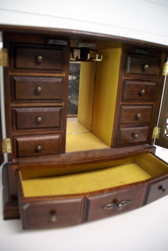
Even though I don't really think I like this color on the mug stand, I do think it might be perfect for this jewelry box that I scored at an auction awhile back. I think the design of the box, coupled with this vivid color, would make a nice India-inspired piece. Yes???

*This post is part of a series of color posts. To see all past colors, click here.
I like the color. I actually think it would be great paired with a lighter color for some great contrast. It would be very Indian or Bohemian on that jewelry box.
ReplyDeleteYes, I think it would look great on the jewelry box, Kristi! Maybe a little of your distressing to the mug holder will help it out. : )
ReplyDeletei like pastel colour, but the jewelry box is too pretty!
ReplyDeletedita
I like this color a lot, but it does feel a little bland...I think it just needs to be distressed with a lighter color and it would perk right up! So much fun!!!
ReplyDeleteI just wanted you to know that I am giving away a babycakes Cake Pop maker right now and would love for you to come and enter my giveaway! http://simplydesigning.blogspot.com/2011/06/babycakes-cake-pop-maker-giveaway.html
Thanks and have a fabulous Friday!
~Ashley
www.simplydesigning.blogspot.com